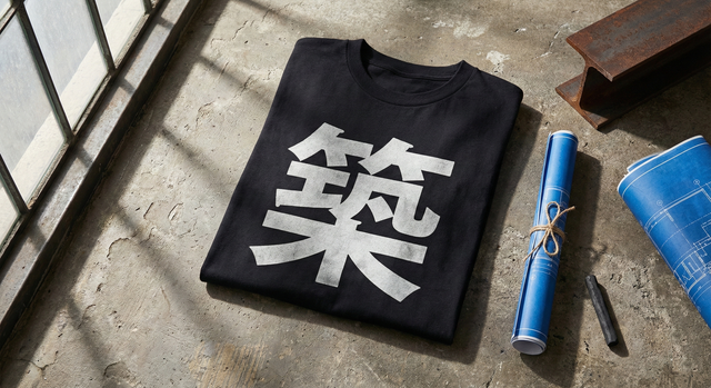
Typography as Architecture: Building with Kanji
When you walk through the industrial zones of Brooklyn or look up at the dense skyline of Tokyo, you stop seeing buildings as places to live. You start seeing them as shapes. Massive blocks of concrete, exposed steel beams, tension, and release.
At ichinichi.studio, we approach typography with the same mindset. A Kanji character is not just a word to be read; it is a structure to be built.
The Weight of a Stroke
In our Japanese/Kanji collection, we treat every brushstroke like a girder. There is a specific architectural weight to characters. Some are top-heavy, looming over the white space like a cantilevered balcony. Others are grounded and symmetrical, like a pre-war warehouse.
The placement of a character on a shirt changes the "skyline" of the torso. It isn't just about what the word means—it's about how the ink holds the space.
Brutalism on Cotton
There is a raw honesty in Brutalist architecture—materials are left exposed, and structure is celebrated rather than hidden. We apply this to our Minimal & Clean designs. We strip away the ornamentation. We let the character stand alone against the negative space.
This "Ma" (negative space) is just as important as the ink. It allows the design to breathe amidst the noise of the street. It is a quiet monument in a loud city.
See how we construct meaning in Today's Drop. We built it to last.


0 Comments
There are no comments for this article. Be the first one to leave a message!