
Handwritten, Then Printed: Keeping the Human Mark
Before the Line Is Cleaned Up
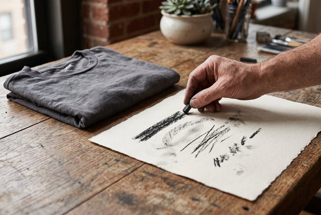
We write a note quickly and leave behind details we did not plan: a letter leaning toward the next, a darker stroke where the hand paused, a gap that feels slightly too wide.
Those irregularities can carry the energy of the moment. When we turn a handwritten mark into a graphic, the first question is which of them matter enough to keep.
Choose the Character Deliberately
We compare the original with a cleaner version. If every edge is smoothed, does the mark still feel like the same gesture? If every accident remains, does it become difficult to read?
The answer depends on the purpose. We may want a readable phrase or an expressive shape. The Japanese Kanji collection also invites attention to marks and spacing, while reminding us that unfamiliar writing has meaning that deserves understanding rather than imitation.
Test at the Size It Will Live
A detail that looks expressive on a large page may disappear when reduced. We look at the mark at its intended scale and allow enough space around it for the uneven rhythm to remain visible.
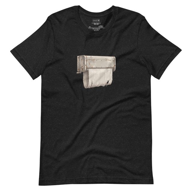
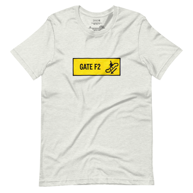
We can view Today's Drop with the same attention: where does a line feel deliberate, and where does it preserve a little movement? A human mark does not need every flaw to survive. It needs the particular detail that makes us feel a hand was there.








0 Comments
There are no comments for this article. Be the first one to leave a message!