
Fit Check, Quietly: How to Nail Proportions Without Trying Too Hard
The Geometry of Comfort
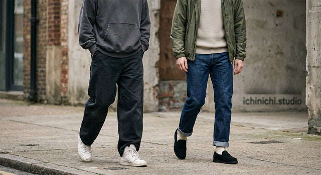
We see it on the concrete every day: pieces that cost a monthly rent check but look entirely out of sync. Style isn't a math problem, but it does rely on a subtle geometry. When we design for the street, we aren't just thinking about fabric; we are thinking about the space that fabric creates around the body. The goal isn't to look perfectly tailored, nor is it to swallow yourself alive in fabric. It is about finding the tension between the two.
The Counterweight Method
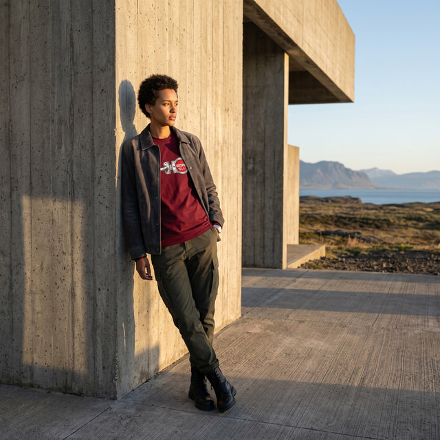
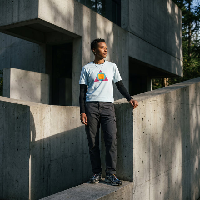
If you are wearing an oversized, heavy-ounce hoodie, your lower half needs to anchor it. Pairing a massive top with skin-tight denim breaks the visual line, making the top look accidental rather than intentional. Instead, look for a straight or wide-leg trouser that drops cleanly over your footwear. If you are exploring our past silhouettes, you can see how we balanced these weights in our design archive, focusing on dropped shoulders paired with relaxed, pooling hems.
Texture as a Visual Anchor
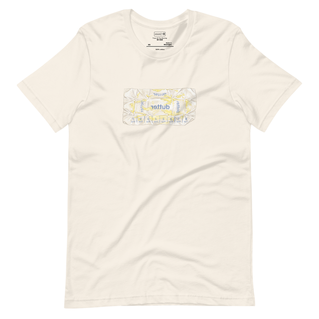
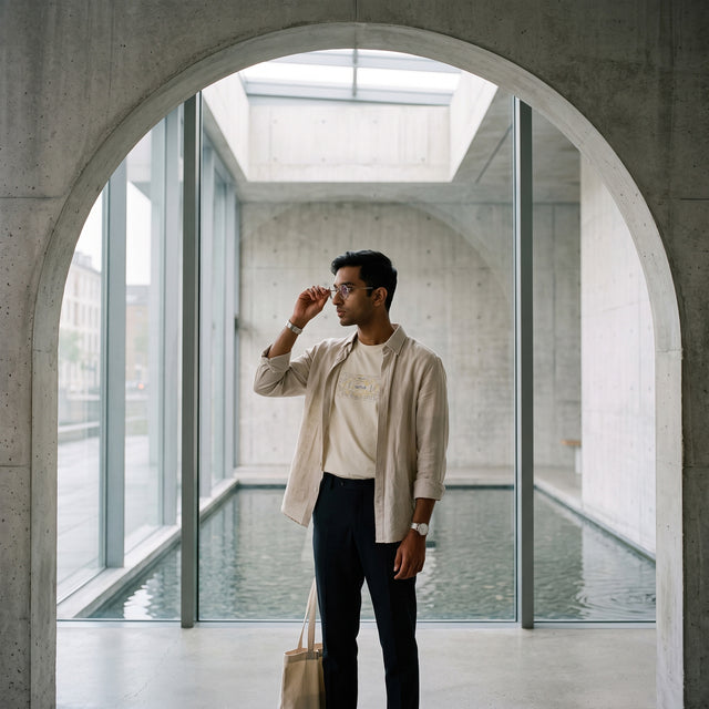
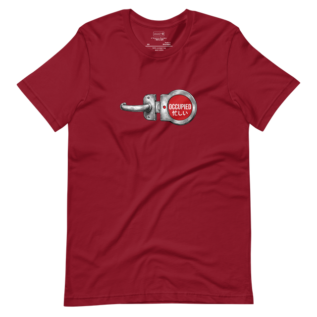
Proportion isn't just about length and width; it is also about visual weight. A flat, thin cotton shirt looks lightweight, while a rough, textured waffle knit or heavyweight canvas carries physical presence. When you keep your palette quiet, texture does the heavy lifting. We lean heavily into this philosophy with our latest releases in today's drop, where raw textures and intentional cuts do the talking so you don't have to. Keep the colors muted, let the fabrics clash softly, and let the silhouette settle naturally.





0 Comments
There are no comments for this article. Be the first one to leave a message!