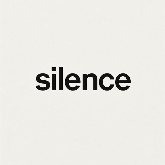
The Weight of a Word
Some words are heavier than others. They don’t need to be long or complicated; they hold their weight in rhythm, in memory, in how they land on the tongue.
In Japanese, a single character can shift meaning entirely. A word might unfold like a poem, carrying history and nuance inside a few brushstrokes. In English, typography gives weight — bold, italic, serif, sans. The same word feels different when drawn differently.
At ichinichi.studio, our text-only shirts lean on this truth. A phrase can be playful or sharp, ironic or tender, depending on its scale, spacing, or silence. What looks simple is rarely simple. Each word is chosen because it holds more than letters.
Words, like design, are not just seen — they are felt. They shape thought, start conversations, linger long after they’ve been read.
The weight of a word is proof that minimalism is never empty. It’s precision. It’s intention.


0 Comments
There are no comments for this article. Be the first one to leave a message!