ロゴよりもテクスチャ:ノイズではなくファブリックで深みを演出
現代のワードローブは、しばしば看板のような存在です。コントラストの強いロゴやネオンカラーのブランドは、眠らないデジタルの世界の中で、人々の注目を集めようと競い合っています。しかし、 ichinichi.studioでは、最も深いメッセージはささやき声で発せられるものだと信じています。私たちは、ノイズよりも質感を重視します。
ミニマリズムの触覚言語
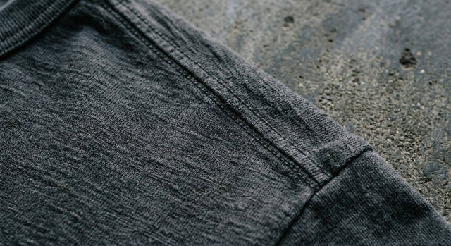
日本のデザインにおいて、 「間」という概念は、単にレイアウトだけにとどまりません。衣服の感覚体験にも当てはまります。胸元の大きなプリントを削ぎ落とすことで、生地の個性が際立ちます。厚手のフレンチテリーやスラブ感のあるオーガニックコットンは、それぞれに独特の地形を描きます。織りが主役のミニマル/クリーンコレクションで、そのクオリティをぜひ体感してください。
通行人ではなく着用者のためのデザイン
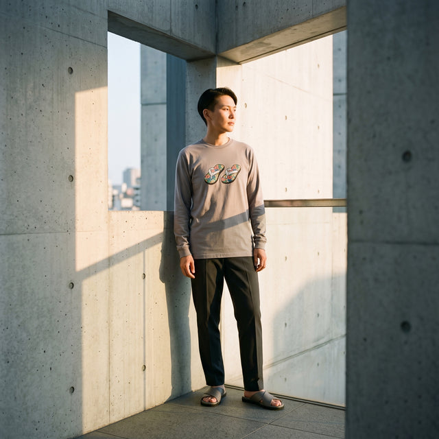
ブルックリン生まれのストリートウェアは、一般的に人目を引くことを要求します。しかし、東京の洗練された職人技との融合により、その目的は変わります。私たちはシャツを着る人のためにデザインします。袖のドレープ感、裾の重み、上質なジャージーの肌触りの良さ。これらは、まさにプライベートな贅沢です。Today 's Dropでは、グレー、チャコール、オフホワイトといった色調の繊細なバリエーションに着目しています。
静かな遺産を築く
ロゴは流行してもすぐに消えてしまうことがあります。完璧な質感の衣服は、時を経てこそ独特の風合いを増し、侘び寂びの精神を体現します。素材の基盤にこだわることで、アーカイブのアイテムはどれもシーズンが終わっても長く時代を超越した価値を持ち続けることを保証します。重要なのは、気を散らすものではなく、深みです。
街は騒がしい。服こそがあなたの聖域であるべきです。


0 コメント
この記事に対するコメントはありません。真っ先にメッセージを残してください!